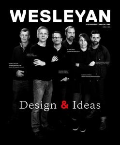
What’s the Story on the Cover?
The Design & Ideas theme inspired the magazine staff to reconsider their own.
They say not to judge a book by its cover. Magazines are a different story.
On the front of this issue, for instance, you might notice the faculty’s intense focus on you, the reader. That was a purposeful choice. Editor Cynthia Rockwell’s coverage of the Integrated Design, Engineering, and Applied Sciences (IDEAS) minor, about which you can read more starting on page 8, has caused our staff to marvel at how these teacher-scholars so fully engage their students—taking their deep expertise, a preternatural understanding of how students learn and what most interests them, and pairing them to great effect in the classroom. That is a model we hope to emulate—focusing on what is most valuable to our readers and delivering it in a way that is engaging and meaningful for them. For you.
The data tells us that our print publication is the most popular and important source of Wesleyan information for alumni by a wide margin. Around 90 percent of respondents read the print magazine occasionally, very often, or always, and about the same number spend anywhere from 10 to 60-plus minutes with each issue.
We appreciate and thank you for your readership, and we’ve worked hard to honor it by enhancing the print magazine in the following ways:
• Focusing more on striking portraiture that highlights the unique individuals who collectively make Wesleyan the vibrant place it is.
• Expanding the magazine’s physical size to offer more room for compelling photography and graphics that illuminate stories for visual learners.
• Adding a “What You’ll Learn in This Issue” section to the Table of Contents to make it easier for readers to find what most interests them.
Another data point to consider: 72 percent of alumni under age 35 get most of their information digitally. If we really want to emulate Wesleyan faculty, we must do a better job of engaging recent graduates and meeting them where they are, which often is online.
To that end, we are launching a new online magazine. Wherever you find a “magazine.wesleyan.edu for more” in the print version, that is your cue to head over to our online site. There you will find a wide variety of complementary content meant to enhance your reading (or viewing) experience, better serve a digitally native audience, and allow us to tell Wesleyan’s stories in new, compelling ways. A few examples from this issue:
• A video capturing students’ final “hopper” project presentations from IDEAS 170.
• More on podcaster extraordinaire Avery Trufelman ’13 and her favorite shows.
• An exclusive interview with Miranda Haymon ’16 on her powerful theatrical adaptation of Franz Kafka’s legendary short story “In the Penal Colony.”
• A map of New York City walking tour sites featuring Kwei Chang ’05 and Benson Gillespie ’04 and their architectural collaborations.
• More on Steve Badanes ’65, the designer of the Fremont Troll and now professor of architecture at University of Washington.
One of the best things about the internet, at least for a magazine team, is its lack of page limits and strict publication dates. We plan to use that freedom to enhance and expand on the work we do in the print magazine, both by including a variety of new multimedia elements and through additional stories in between each print issue that capture the full breadth of the Wesleyan community’s experiences and accomplishments.
And we need your help. Tell us about any achievements, whether yours or a fellow Cardinal’s. Keep us informed about what’s important to you. Let us know how we’re doing at magazine@wesleyan.edu.
Because there is something else the IDEAS faculty has reminded us: Collaboration is crucial to success. Go Wes!


