Mapmaking’s Double Edge
Associate Professor of the Practice in Earth and Environmental Sciences Kim Diver and Sam Raby ’17 use cutting-edge visualization tools to inform and empower. But bringing data into such stark relief poses a unique set of challenges.
A funny thing happened on Kim Diver’s way to becoming a graphic designer. Something similar happened on Sam Raby’s way to becoming a doctor. Maps led them in a completely different direction.
Diver and Raby are both new-age cartographers: mapmakers for the digital era. In place of traditional tools of the trade like sundials and sextants, they use a computer-based one called GIS. Short for Geographic Information System, GIS is a relatively new means of data presentation that has opened up whole new fields of scientific and social inquiry.
At its core, GIS is database management software. Far from the staid visions of Excel spreadsheets that may conjure, it is often or mostly deployed for mapping purposes—capturing, analyzing, and presenting spatial or geographic data in clear, creative, visually compelling ways. The term was first coined in a 1968 paper by the “father of GIS” Roger Tomlinson, who developed the first computerized GIS in the world for a Canadian aerial surveying company. While the technology has been in use for around 50 years, recent advancements in computer and internet technology have democratized it like never before. GIS now goes well beyond traditional cartography by incorporating variables like time and historical context into spatial arrays and presenting them all in unison. Think of it as a kind of time machine that allows users and viewers alike to reimagine the past and (sometimes, at least) more clearly see into the future.
“Maps aren’t just for seeing data that has already happened,” Diver says. “They help predict patterns and model reality in such a way as to make these predictions benefit a community. That community could be a country, an environment, a local population; the benefit could be wayfinding, or deeper understanding, or advocacy. Whatever it is, you first have to make sure the data is of high quality. Students have to learn (and people have to recognize) who created the data, how good they were at collecting it, what biases they may have, and what’s missing from the set. People tend to think ‘Aha! A map. That’s the absolute truth.’ But it’s not. Not even close.”
Therein lies the double edge that any modern mapmaker has to navigate. GIS is a powerful tool for helping others understand the world and their place in it. But as much as it can help predict and thereby help us prevent things like the spread of a disease, it could also be used to purposefully misinform—say to gain support for an unpopular initiative or sway an election. It is Diver’s and Raby’s challenge, equal parts exciting and daunting, to clearly visualize data sets and, at the same time, help their students and viewers clearly visualize the problems inherent in them.
Finding Their Way to GIS
 At her undergraduate liberal arts college, Kim Diver first enrolled in a geography course because it fulfilled several general education requirements. She quickly discovered, however, that she had an interest in and knack for understanding spatial data. By junior year, her professors were encouraging her to double major in geography (alongside graphic design). By senior year, they were encouraging her to pursue it in graduate school.
“My grandmother told me when I was younger that it didn’t matter what I wanted to do, I had to learn computers,” Diver says. “I laughed and said ‘Haha, Grandma, I’m going to be in advertising or something.’ Then I went off to college and immediately learned computers. I also got interested in how patterns and locations play a role in so many things.”
One of Diver’s first courses in graduate school was a GIS course about cartography (taught by renowned geographer Mark Monmonier), which showed her how well geography and graphic design played together. She went on to earn both an MA and PhD from Syracuse University, studying and publishing extensively on island biogeography. Today, she is an associate professor of the practice in Earth and Environmental Sciences at Wesleyan, where she teaches one advanced and two entry-level GIS courses and manages the GIS Assistants Program.
Sam Raby ’17 took his first GIS class the second semester of his freshman year with Diver. He then served as a GIS assistant for two years under Diver’s tutelage and grew so competent in the discipline so quickly that by his senior year, he was teaching a class called “Critical Cartographies” to other students on Story Maps, one of the most recognized GIS mapping tools (Story Maps is to GIS as Adobe Photoshop is to graphic design). What was most surprising for him wasn’t his ability to scale the steep GIS learning curve, but that he’d discovered the discipline in the first place.
“I entered Wesleyan premed,” Raby says. “A lot of folks in my family are doctors and I saw that as the only possible career choice. But [Professor Diver’s GIS] course sparked something in me. It felt like a synthesis of quantitative and qualitative work in the most wonderful way. It was a truly interdisciplinary subject. Typically, you’re either doing hardcore math stuff or you’re thinking about the design and social implication side of things. This was exciting because it meant I didn’t have to silo myself. It allowed me to do a little bit of everything, and that speaks to the kind of person I am. That course, and Professor Diver’s mentorship, were really foundational for me.”
Putting Wesleyan on the Map
 Raby came to GIS at an interesting time for it in the Wesleyan curriculum. Though it had previously been taught exclusively in the Earth and Environmental Sciences department, Diver recognized its utility and was beginning to think about how it might be useful for a broader set of students. There wasn’t yet an advanced GIS class for Raby to take, so he approached Diver about doing an independent tutorial, already with a project in mind. It ended up being a fortuitous match.
GIS offered exactly the kind of tool Raby had been looking for to help capture and tell his family’s complicated story. His father’s side originally came from Baghdad, Iraq, and was displaced in the 1960s, making their way circuitously out of their country and eventually to the United States.
“What was special is that my dad has a very keen sense of geography,” Raby says. “I’d noticed that whenever he’d talk about that point in his life, it’d be very geographical and that was unique. It was a moment in his life where everything, particularly his sense of place, was changing so drastically. So, I thought this would be an interesting way to apply GIS, a way to capture and preserve this story and my family’s history that would mirror how it existed in my father’s head.”
Raby set about creating a series of narrative maps based on his father’s account, as well as what was at the time a very experimental way of recording a geographical oral history. His family’s history and father’s journey came to life in a way they hadn’t previously, as did Raby’s vision of his own future.
“It was a really personal process,” Raby says. “It was so important for me in terms of my own development—seeing how mapping and storytelling came together in a professional way that could still be very personal and emotional. For the first time, I felt deeply connected to the work I was doing. It was the first time I could see a future outside of just being what the rest of my family had been. I no longer had to be a robot that checked my life at the door.”
Raby’s experience was an early example of what Diver has since seen become a trend: students realizing and capitalizing on the value of strong, creative data-based visualization tools, especially in areas like the humanities and social sciences that benefit greatly from these novel approaches. This trend is reflected in ever-increasing enrollment in GIS courses, particularly QAC 231. Taught through Wesleyan’s Quantitative Analysis Center (QAC), this course introduces “social science and humanities students to spatial thinking” using popular GIS tools like Esri, ArcGIS, Google Fusion Tables, and Mapbox. It is a way for students with no previous data visualization experience to learn that skill in the context of their other studies and interests, and tends to be an eye-opening experience for them, as it was for Raby.
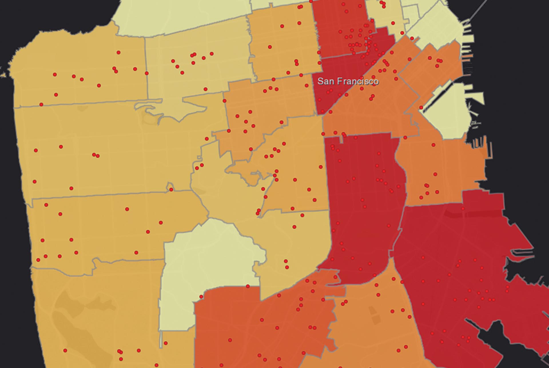
“Once you put things on a map, you can see spatial patterns immediately,” Diver says. “Students in environmental fields take GIS skills where you’d expect—graduate school, into jobs in conservation. But it’s also neat to see things like history students using them to map out the flow of knowledge in medieval England, like they did with [Professor of History] Gary Shaw. GIS is becoming more well known among the student body and recognized by faculty for how it can apply to their work. We’re seeing a big resurgence of geography through geospatial technology.”
This interdisciplinary approach hasn’t been without its challenges. For one, Diver points out that it can be difficult to find or create reliable data sets with qualitative data, as many social sciences and humanities students have to do before they can map the information (quantitative data, by comparison, is usually more straightforward for importing into a database tool like a GIS). Another challenge was somewhat self-imposed. As word spread around campus about the utility of GIS tools, Diver had to devise a way to meet the increasing demand for those skills. That’s how she came about forming the GIS Assistants Program, a team of students with strong mapping skills available to help faculty create visualizations for everything from class discussions to high-level research papers.
“It’s very rewarding for me to see students pick up the skills and go and collaborate with other faculty on campus,” Diver says. “Students are learning more because they’re working with faculty at a high level, and faculty are having their data looked at spatially, in new and exciting ways. Since I’m a geographer at heart, everything is interdisciplinary to me and it’s great to see that playing out.”
Mapping in the Real World
 More on Raby’s impeccable timing: just as he was getting interested and developing his GIS expertise, Diver got a call from Allen Carroll. Carroll is the former art director and chief cartographer for National Geographic, and the founder of the Story Maps team at Esri, a GIS powerhouse (kind of like the Google of the GIS world). He also happened to be the father of one of Raby’s classmates and was looking for a talented intern to work at his company.
“I opened it up to all my students,” Diver recalls. “And Sam was right on it. He applied and they hired him. The cool thing is it wasn’t just learning more about the interface; he got to learn what goes on behind the scenes and on the back end of the technology.”
Following his earlier success mapping his family’s oral histories and his internship, Raby started working with the Story Maps team on a contract basis to chronicle other refugee stories. The project, “Placing Oral Histories,” allowed him to interview different Syrian refugees living in central Europe and map the paths they took out of their home country and to the United States.
“It was a great honor for me to speak to folks that had similar—and also very different—experiences as refugees to my family and me,” Raby says.
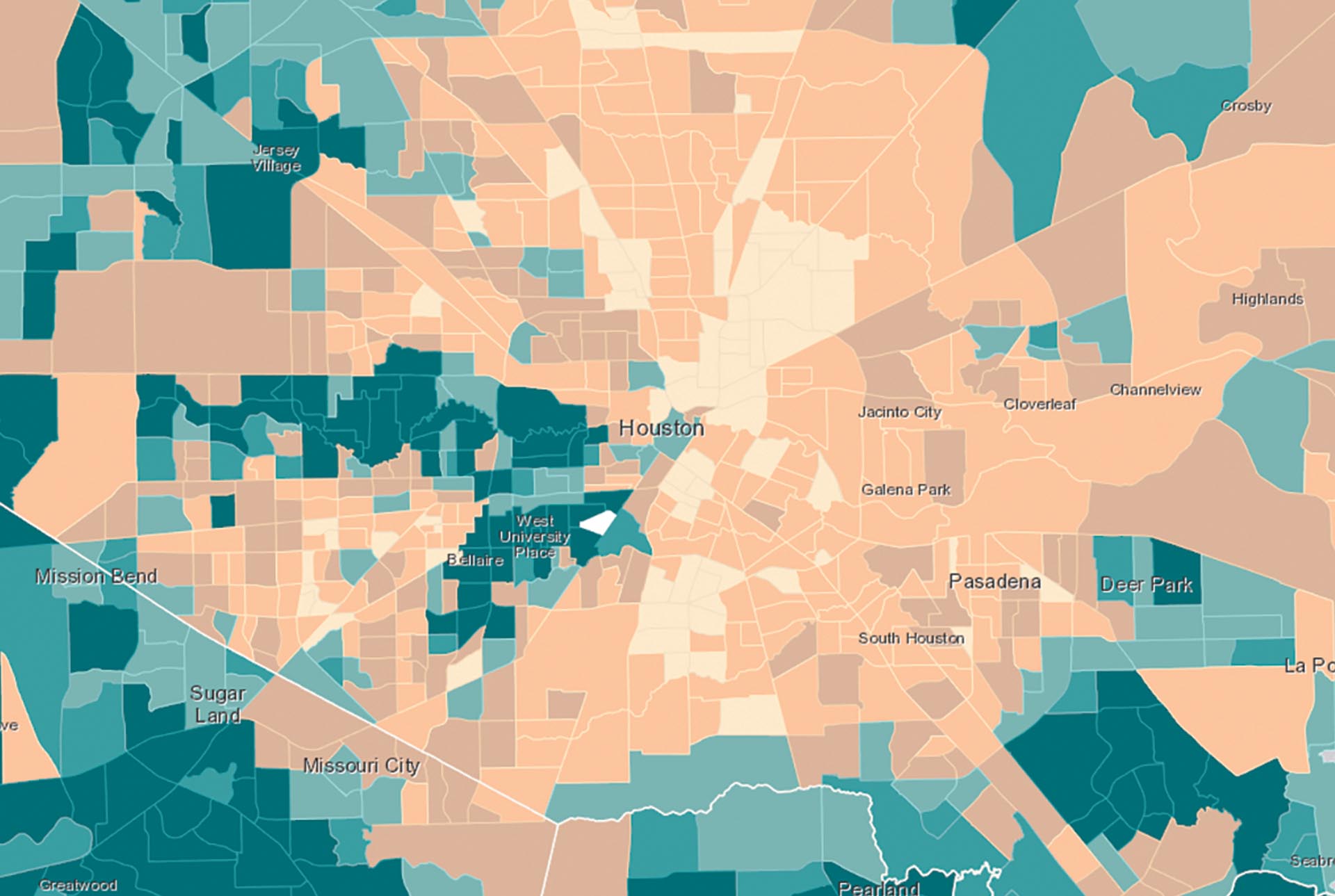
After graduating from Wesleyan with a cutting-edge set of GIS skills, Raby moved to New York City and started working in a completely different environment at Vox Media’s Curbed, a popular online real estate publication. Suddenly the math major was a data journalist, Curbed’s first, and set to work doing research on how the affordable housing system in New York worked (or, more often, didn’t). This work yielded pieces on “the weirdness behind what the city defines as affordable” as Raby described it and a map that visualized the extent of the affordable housing crisis.
“I’ve focused my GIS projects on policy work and mapping with social data,” Raby says. “That can be a tricky field to apply any kind of technology, because we know that technology is often disruptive. Especially when we’re talking about people, there can be a gap between technology and real understanding. One of the big challenges of using GIS in the real world that I work hard at is using it to enhance subjective and qualitative aspects of certain projects rather than bulldozing over them.”
Today, Raby works for JustFix.nyc, a nonprofit that creates technology for tenants and tenant organizers fighting displacement in New York. It’s been surprising for Raby to clearly see the challenges those groups actually face, as opposed to how they are sometimes described in the media or conceptualized beyond the local level. For example, Raby explains that tenants and tenant organizers well understand what the trends and challenges are, but there are significant institutional barriers to accessing the kind of data and information that would allow them to advocate for themselves more strongly. In New York City, researching a landlord and the properties they are associated with requires navigating a database that is complex and difficult even for trained users. It’s a problem that GIS and data visualization, when done correctly, is adept at solving—building interfaces that process that data quickly and render it intelligibly.
“It’s about using technology as a communication tool rather than as an investigation tool,” Raby says. “That’s come to be a big piece of how I view my professional work. This should never be something you do to become famous or create waves for the sake of creating waves. This is a way to help folks who are already making waves. The best work I’ve seen elucidates things that people have been talking about for decades and finds a way to speed up those processes and break down institutional barriers.”
The Key to Good Data Visualization
 Because of its many applications, there is no standard playbook for a career in GIS. Diver is consistently amazed by the breadth of her students’ ideas, many involving concepts (such as one student’s creation of a space-time cluster analysis) that she learns along with them. In the span of two years, Raby has employed his GIS skills in higher education, tech, journalism, and the nonprofit world. The through-line of their work, however, is consistent: prioritizing clarity.
“With Professor Diver and then at Curbed, I learned the importance of making sure your analysis and visualization are simple,” Raby says. “I’ve had a hard time with that. Once you become interested in the technology, there’s a push to make things fancy and overcomplicated. You see that a lot in the media, where The New York Times really flexes for some of the visuals they make. To me, I think that’s bad practice because the main goal is to make something intelligible to a lot of people. Trying to blow people’s minds is not the goal.”
“Infographics are kind of a fad right now,” Diver says. “They’re cool. When they first started catching on, it was the bells and whistles that grabbed people. But a lot of times those things make it more difficult to understand something that’s already complex. I tell my students that the key is to get an idea across in about 30 seconds. Then you can include ancillary information, but sort of in the background, so that a person will get the main point and then can dig into the complexities more if they want.”